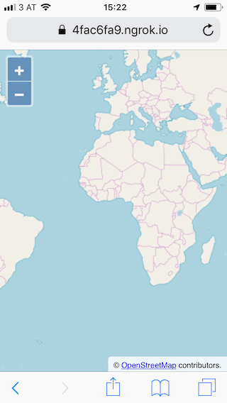
A mobile map
OpenLayers supports mobile devices out of the box, providing multi-touch gestures like pinch zoom and rotation. So there is nothing OpenLayers specific to do here, only the general rules for mobile web pages apply.
The nice thing about mobile devices is that we have access to sensors like the GPS or a gyroscope, which we will be using here as a compass.
Markup for a mobile web page
We start with the same markup in index.html as we had for the basic map we already created. The only difference is an additional meta tag in the document's head to add device-width and initial-scale settings for the viewport:
<!DOCTYPE html>
<html>
  <head>
    <meta charset="utf-8">
    <meta name="viewport" content="width=device-width, initial-scale=1">
    <title>OpenLayers</title>
    <style>
      @import "node_modules/ol/ol.css";
    </style>
    <style>
      html, body, #map-container {
        margin: 0;
        height: 100%;
        width: 100%;
        font-family: sans-serif;
      }
    </style>
  </head>
  <body>
    <div id="map-container"></div>
    <script src="./main.js" type="module"></script>
  </body>
</html>
A street map for navigation
The map we start with in main.js is the same as the basic map from the previous exercise:
import OSM from 'ol/source/OSM';
import TileLayer from 'ol/layer/Tile';
import {Map, View} from 'ol';
import {fromLonLat} from 'ol/proj';

new Map({
  target: 'map-container',
  layers: [
    new TileLayer({
      source: new OSM(),
    }),
  ],
  view: new View({
    center: fromLonLat([0, 0]),
    zoom: 2,
  }),
});
Testing on a mobile device
Since a gyroscope is typically not available on desktop computers, we'll need to test our application on a mobile device. For security reasons, access to the Geolocation is only granted to pages served over secure connections.
The easiest way to achieve that is to use https://ngrok.com. Once set up, the application can be served with the following command in a new terminal:
./ngrok http 5173 --host-header="localhost:5173"
When everything works, open the https:// page indicated by ngrok's output on a mobile device:
